Monday, March 21, 2022

Comics I Sold: Targitt #1

 Once upon a time Martin Goodman sold Marvel Comics (and his other magazines) to Perfect Film and Chemical. Marvel continued on without him and Perfect eventually fired his son, Chip Goodman, from whatever Marvel job he had.

In retaliation, Martin started Atlas Comics (Atlas was one of many names Goodman used for his comics publishing prior to standardizing on Marvel) and tried to snatch up the best talent from DC and Marvel. Folks working for Atlas included Larry Lieber (Stan Lee's brother and Martin's nephew), Neal Adams, Howard Chaykin, Ernie Colon and many others. There was a black and white Warren style line and a color Marvel style line. The color comics each lasted about three months, and the final issue was often a change of direction to make the title much more like a Marvel superhero comic.

So here we are with Targitt #1. The Atlas trade dress and design work look an awful lot like the Marvel trade dress of the day. And that cover, not credited in the comic, but attributed to Dick Giordano online, is pretty nice. I'm not sure that it needs the word balloon, it looks to me like Targitt is already in plenty of danger without letting him know he is going down with the ship.

Boy, if the artwork inside is this good, then this book will certainly be a hit.

Uh oh. 

To be fair, the artwork is pretty mixed throughout this issue. There are some panels that are occasionally grabbers, outnumbered by awkward storytelling and even more awkwardly drawn panels.

The single best panel is the double page spread with the story title, the credits and an exploding airplane, which is pretty spectacular.


The artist here is Howard Nostrand, who I mainly remember from Cracked magazine. He was a good airplane artist, kind of but not exactly like Bill Ward was a good girl artist.. Really. There was a nice picture of a jet plane in a movie or TV parody and there was a note from Howard Nostrand saying something like "Look at this plane! It looks like something out of Steve Canyon! Try and top that, Severin!". Probably one of the funnier things I saw in Cracked, which I would only get when I was too desperate for more Mad to wait until the next issue. Here Mr. Nostrand is clearly playing to his strengths in aviation art. It's too bad the rest of the book doesn't have more airplanes. 

Here's a nice Atlas house ad drawn by Ernie Colón, who at the time I thought of as "The Good Richie Rich Artist". That guy in the foreground looks like his and Roy Thomas' "Arak, Son of Thunder" who is about 10 years away at this point. Colón is a seriously underrated comics artist, in my humble opinion. His Medusa Chain is a pretty swell album-type science fiction graphic novel and his art on Arak, Son of Thunder and especially Amethyst, Princess of Gemworld are terrific.

The comic itself is kind of a violent mess, Targitt becomes a rogue FBI agent after his wife and daughter are killed in a really well drawn plane bombing. There are shootings and stabbings and various beatings going on. This is more violent than the cop shows of the day. But it's not particularly engaging.

There's also a helicopter explosion at the story's climax. It's not as well drawn as the plane explosion. It's still pretty cool.

There's also a Bullpen Bulletins style page listing the absurd number of comics Atlas was releasing in it's first couple of months. I wonder if Atlas could have made a go of it if they had eased into the market and not made so many changes to their titles after two issues. Had the Goodmans played this right, they could have their own staple of successful comics that launched a series of movies and merchandising. Instead, we just get a mess that was over before it started.


Next time I am here I want to take a look at Superman Family #182, one of DC's first two Dollar Comics. 

Saturday, March 12, 2022

Dollar Comics: House of Mystery #215

 I like big books and I cannot lie.

Specifically, I like big comic books! 100 Page Super-Spectaculars, 80 Page Giants, Giant Size Man-Thing, Treasury editions, whatever!


For some reason, comics as periodicals keep reverting to 32 page floppies. Which are a low profit margin item at the best of times. Comics were dying a slow death in the 1970's.


When Jenette Kahn became publisher at DC in the 1970’s one of the first things she did was create Dollar Comics. These, as the name suggests, cost a buck. They had way more pages than a regular comic, sometimes they had wraparound covers and no ads, and they delivered more profit per unit than a standard sized floppy. I have read that they were sold in places that normally did not sell comics.

These lasted 5ish years - I think tying the name into the price point might have been a mistake during times of inflation. Dollar Comics went from 80 pages to 48 pages during this time. Not long after that, regular 32 page comics cost a buck.


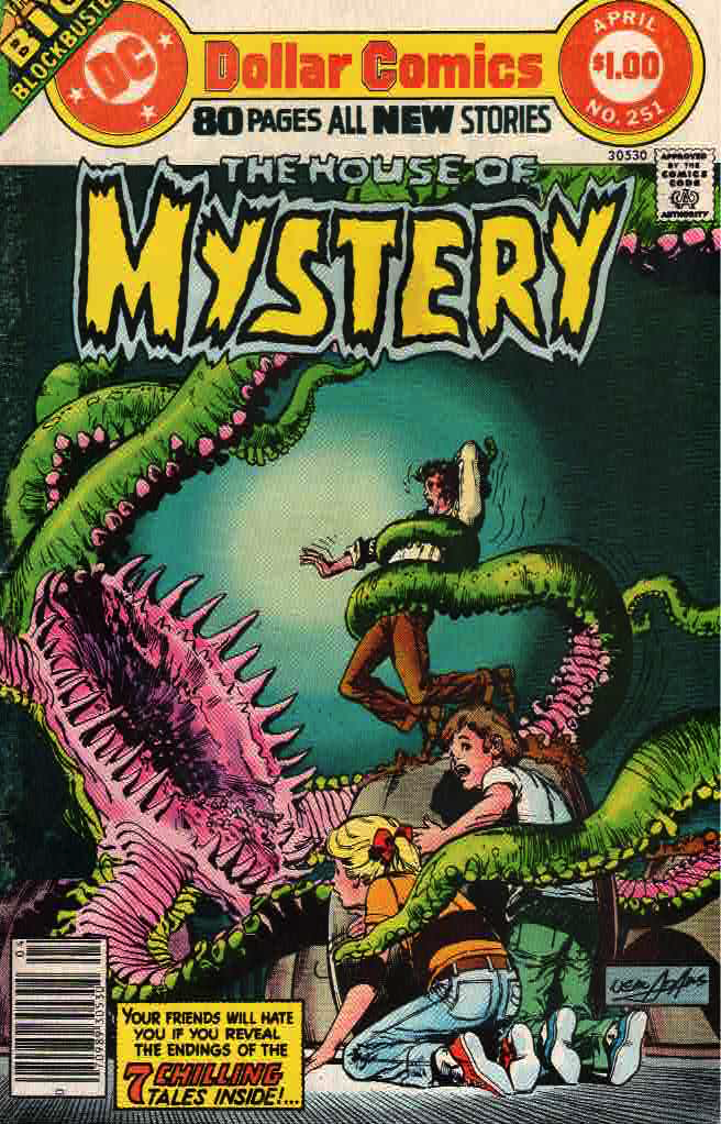
The first two Dollar Comics were House of Mystery #251 and Superman Family #182, both on sale December 14th, 1976. (According to http://www.mikesamazingworld.com/mikes/features/guide.php?page=giant&groupid=38 which has a nice overview of the Dollar Comics line.)


Today, we will be looking at House of Mystery #251. Which cost a whole dollar.


There’s a wicked Neal Adams cover that vaguely ties in to one of the stories, although the monster on the cover is bigger, scarier, better drawn and menacing some children. Children always seem to get menaced on the front covers of ‘mystery’ titles.


Check it out!


As for the insides, it’s a mixed bag, which is pretty common for these ‘mystery’ anthologies. A couple of stories are really nicely illustrated, but none of the stories is much of a grabber. These are milder EC stories. Still, that cover is pretty great.


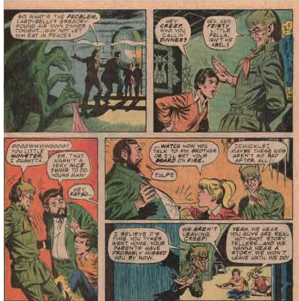
First off is a framing sequence that is not credited, but attributed online to Paul Kupperberg, John Calnan and Jack Abel. Cain and Abel are telling stories to some jaded kids that Goldie brought to the House of Mystery. Really, Cain and Abel’s whole existence (prior to The Sandman) was telling stories to jaded kids.


The storytelling in this sequence is a little off. The interactions between Cain, ABel and the kids pictured below don’t quite land. I am a man of no talents, but I think these panels could have been laid out a bit better and more funnily because the dialogue is amusing.

The first proper story is “Return of the Vampire” by Jack Oleck and Frank C. Reyes. It’s nicely drawn, but the production doesn’t help the artwork. The story is mystery book predictable, but perfectly OK.

As you can see, the printing technology of the time left some unsightly off-register bikini lines.


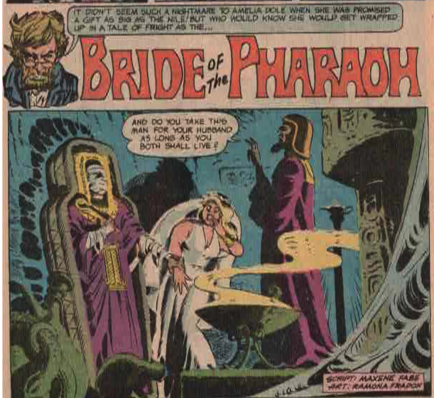
Next up is “Bride of the Pharaoh” written by Maxene Fabe and illustrated by the great Ramona Fradon. The splash panel is kind of a spoiler alert for a fairly predictable story that takes place in “Egypt”. Quote marks because I’m not sure how accurately the story reflects life in that country. Or, really, any country ever.


Curt Swan and Vince Colletta give us a story in which Aquaman uses Hostess Twinkies to defeat undersea miscreants. While the page says “Advertisement” at the top, I would prefer to think of it as being in Continuity. Even Post-Crisis and Post-Zero Hour and Post-New 52 and Post-Rebirth and Post-Convergence Continuity. Because Twinkies.


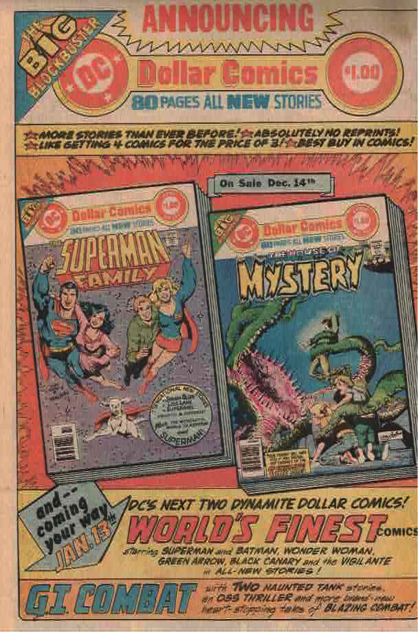
Here’s a house ad for Dollar Comics themselves, featuring this issue and the first Dollar Comics issue of Superman Family. I was reading comics at this time, but very rarely splurged on Dollar Comics. Not sure why, although none of the Dollar titles were things I had been reading regularly, or as regularly as one could given mid-70’s comics distribution in the small-town Midwest.


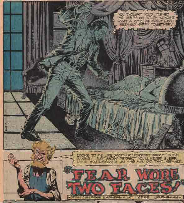
The next story is pretty spectacularly illustrated by Jess Joploman and written by George Kashdan. The story is a little predictable.


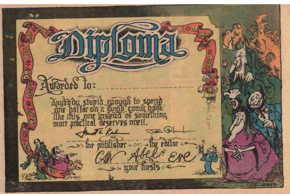
There are some short features in here as well, like one page cartoons by Sergio Aaragones, 2 pages of letters and a Diploma in which Jennette Kahn, Joe Orlando, Cain and Abel call me stupid for buying this comic for a dollar. The joke is on them, as I bought it as a back issue for even more than a dollar.


Steve Skeates, Ernie Chua and Bill Draut give us what is easily the best drawn thing I have seen from Ernie Chan’s work at DC. I dunno if that’s Bill Draut’s inks or what, but Mr. Chan’s cover at DC in the mid 1970’s were not good at all. Like weirdly amateurish. This story is pretty OK, too. Better than the average mystery book story.


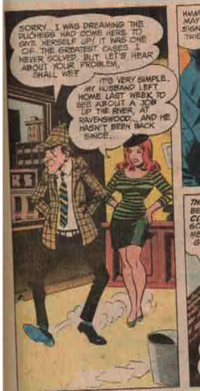
The next story is illustrated by EC great Wally Wood and it’s the best thing in here. The story is fun and funny - maybe it was originally destined for Plop!. I liked it.

Wally Wood sure knew how to draw dames!

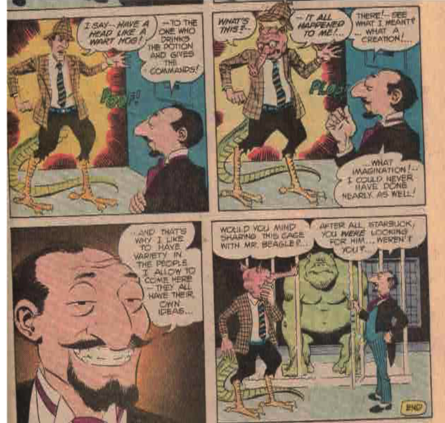
As a bonus, the story features a guest appearance by Wonder Wart-Hog!


There’s an uncredited three page look ‘Behind the Scenes’ at the House of Mystery, which has a caricature of Paul Levitz in it.


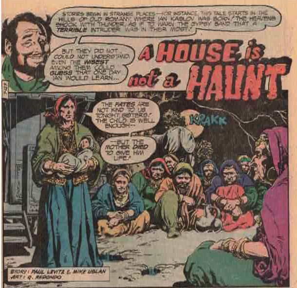
There’s a story by Paul Levitz, Michael Uslan and Q Redondo that is nicely illustrated and follows the mystery book formula pretty closely.


Our cover story is by Jack Oleck and Alfredo Alcala. Nicely illustrated. Has a kind of Swamp Thing thing going on, but without the tone that made that first Swamp Thing story so great.


And those kids from the framing sequence? I guess they didn’t find these stories all that scary at all.


Saturday, February 26, 2022

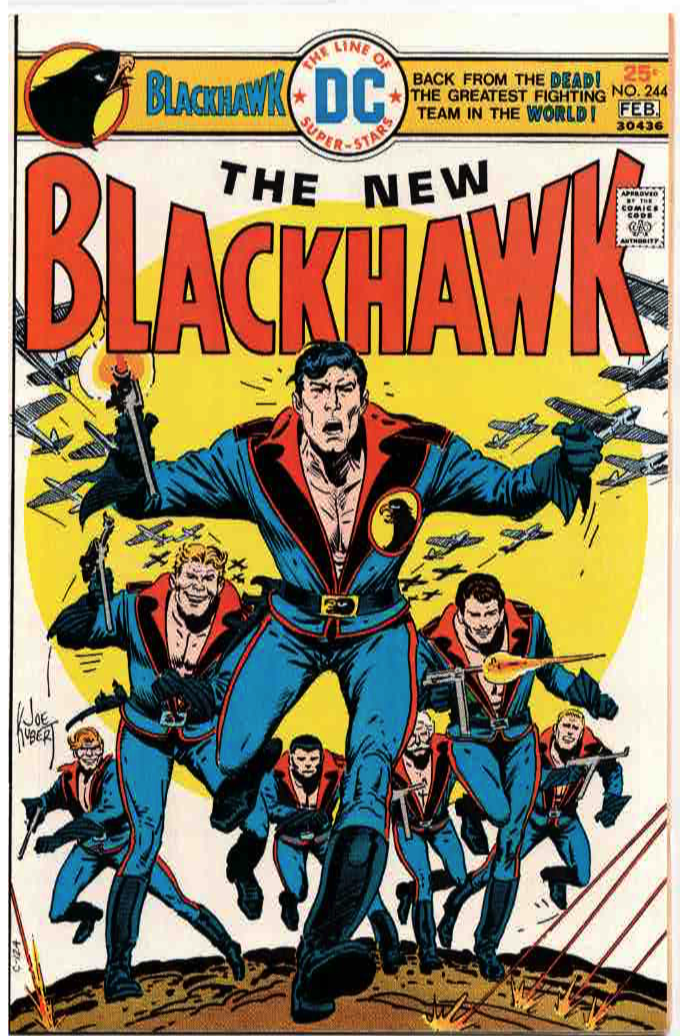
Comics I Sold: Blackhawk #244 - Introducing The Disco Era Blackhawks.

 Here is a comic I recently sold on ebay. I am pretty sure I bought it long after the fact, although I do remember seeing it on the stands.

When last we saw the Blackhawks they were - well, I dunno. Can't say I have read a lot of Blackhawk comics in my time except that Howard Chaykin series. The last time we saw them before this the Blackhawks were probably in crappy super-hero mode, a laughable last ditch attempt to make them relevant in the 1960's.


But now they're back! In swingin' seventies sporting disco-era chest-baring outfits and a swell cover by Joe Kubert. These disco uniforms are a lot better than their superhero costumes and some of their other 1960's uniforms. If Blackhawk would spring for some shirts they would be fine as heck.

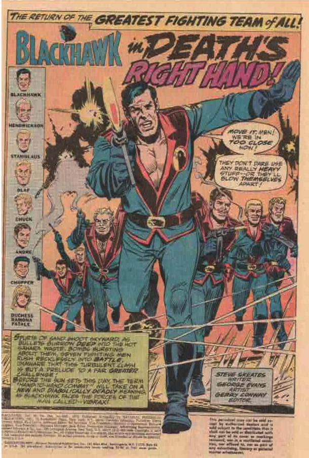
The actual comic is written by Steve Skeates and drawn by one-time EC artist George Evans. This isn't his best work, and kind of swings between terrific and not-so-terrific in terms of quality. No inker is listed, which is probably for the better. In the 1970's a lot of DC's inkers were super heavy handed. While George Evans' art here isn't great it is certainly better than it would be if it were inked by an unsympathetic inker. It’s not hard for me to fault an EC guy for later artwork than isn’t up to the EC standards. By the 1970’s, not much comic art was.

From the indicia, we can see that this is Carmine Infantino era DC, or National Periodical Publications. N.P.P. is the sort of name you could give to your comics company if you were ashamed of publishing comics.


As for the story, we find the Blackhawks finishing a mission for a mysterious "Robinson" who talks to them over a two way TV installed in Blackhawk's jet. However, there's a missing piece to the puzzle - they recovered the plans for a MacGuffin, but not the MacGuffin itself. Mission accomplished, the Blackhawks jet off to their respective hideaways in their respective countries


Except for Hendrickson, who lives on Blackhawk Island. There, he is surprised by a redhead with an eyepatch wearing a bikini. Which I would be, too.


The redhead is Duchess Ramona Fatale, apparently a sometimes friend and sometimes foe of the Blackhawks. She needs their help.


The big bad in this issue is Anton Vibrax, who has a super vibrating hand. I guess name dictates destiny in this case. He can straight up murder people with it. No word as to whether the ladies like this super feat or not. Except Duchess Fatale who is definitely not impressed.


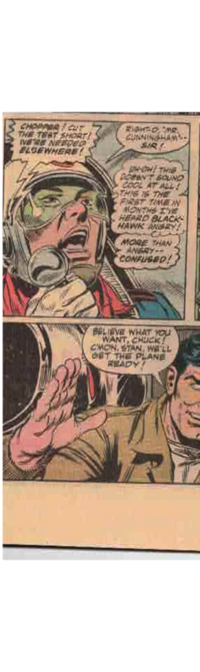
In these issues, the former embarrassing Asian stereotype Chop-Chop is now called Chopper and he is the best pilot in the group whose name is not Blackhawk. He also does not speak in any sort of racist dialect this time around.


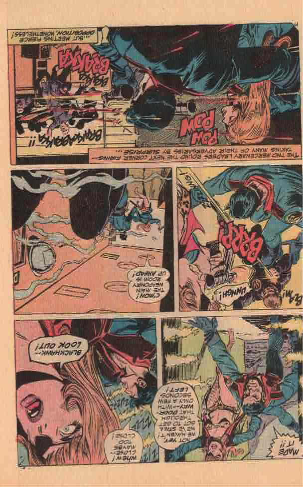
Duchess Fatale wins my admiration for her bravery in walking into a firefight wearing nothing but a bikini and a jacket.


Oh, and an eyepatch.


Poor Anton Vibrax gets vibrated to death! Which is kind of ironic?


And it turns out there's MacGuffin relating to the very beginning of the story, with Blackhawk leaving Lady Fatale high and dry.

It's an OK start to a new Blackhawk series. None of the characters save Blackhawk or Lady Fatale get a lot of page time, but it sets up the series for new readers pleasantly enough with the Blackhawks living around the world and coming together in their jets whenever they are needed.


Not sure where, say, Andre parks his jet in Paris but I am sure there is a perfectly reasonable explanation.


As a kid who read the hell out of the Steranko books the Blackhawks should have been manna from heaven for me. Not sure why I skipped it the first time around, except I probably didn;t have twenty seven cents (cover price + sales tax) with me when I needed it.


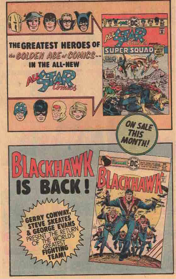
Speaking of manna from heaven for kids who read the hell out of the Steranko books, here is an ad for this comic and for the return of All-Star Comics featuring the Justice Society. I bought the hell out of that comic, and the next issue. Then I don’t think I ever saw one again on the newsstands. The struggle was real in the 1970’s kids.


Sunday, February 20, 2022

Whither Larger Comics?

 Why did American comics always go with the cheapest possible package? Why did they devolve from 64 page anthologies to 32 pages including ads?

I guess the long term answer is ‘sales’ and 'costs'. Cheap funnybooks probably sell better than more expensive ones. The main audience for comics was traditionally kids. Kids generally do not have access to a lot of money. More expensive comics might have meant more profit per unit, but fewer units in sales. 


There were occasional thicker comics in the 1940’s, but given that comics started out at 64 pages (and then shrank) there were not a lot of them.


EC comics managed to put together a larger (both in size and in page count) comic by transitioning Mad to a black and white magazine. Warren’s magazines followed a similar format. Later on Marvel ran with magazine sized comics for around ten years. Magazine sized comics never really stuck in the US, except for Mad.


Some of the upstart publishers in the 1960’s went with a larger (more pages) comic for a quarter instead of the then-standard 12 cent comic. Tower Publications did this with T.H.U.N.D.E.R. Agents and I know there were others. If I keep blogging maybe I can document some of them.


Marvel and DC both went to 48 pages (advertised as 52 pages because covers and because business people are deceptive) for a quarter in the early 1970’s. Marvel stuck out the format for maybe a month. DC stuck with it longer and Marvel at 20 cents finally overtook DC in sales for pretty much all eternity.


In the 70’s both DC and Marvel did various oversized things. Marvel had some Warren style magazines, Treasury Editions and Giant-Size squarebound comics which included the wonderfully named Giant Size Man-Thing.


DC had various treasury sized comics, pretty much skipped the Warren style magazines and had various Giant sized comics in the 1970’s. My favorite were the 100 Page Super-Spectaculars, which were awesome comics with generally a regular comics worth of new stuff and tons of reprints. As a kid who obsessed over Steranko’s History of Comics those reprints were a godsend.


On the other hand, those 100 pages were really 96 pages + covers. Business people, as I have mentioned before, are deceptive. 


DC premiered their Dollar Comics in the late 1970’s. At the time, proper newsstand magazines like Time or Newsweek sold for around a buck or around 3 times the cost of a regular comic. The Dollar Comics had a lot more pages than a regular comic, 80 at first although this shrank to about 48 over time as inflation took its toll. This was a pretty cool package.


Alas, it was a package doomed to fail. A $1 price point meant that the package would get slimmer and slimmer as time went on. And the reliance on anthologies in the Dollar Comics format made them unpopular in the direct market.


Too bad, it was a cool experiment, and something we will see a few more times at different price points over the next couple of decades.


And, it turns out, the best way to package comics in a thicker and more profitable package in the good ol’ graphic novel. But that’s getting ahead of the game.


Tuesday, September 22, 2020

How long can you hold your breath?

 Asking for a friend.

Well, not so much a friend as Comic Book Bob Hope.

I admire his optimism.