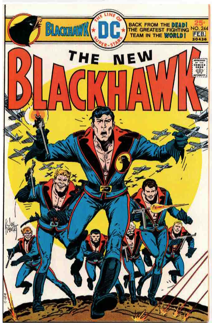
Here is a comic I recently sold on ebay. I am pretty sure I bought it long after the fact, although I do remember seeing it on the stands.
When last we saw the Blackhawks they were - well, I dunno. Can't say I have read a lot of Blackhawk comics in my time except that Howard Chaykin series. The last time we saw them before this the Blackhawks were probably in crappy super-hero mode, a laughable last ditch attempt to make them relevant in the 1960's.
But now they're back! In swingin' seventies sporting disco-era chest-baring outfits and a swell cover by Joe Kubert. These disco uniforms are a lot better than their superhero costumes and some of their other 1960's uniforms. If Blackhawk would spring for some shirts they would be fine as heck.
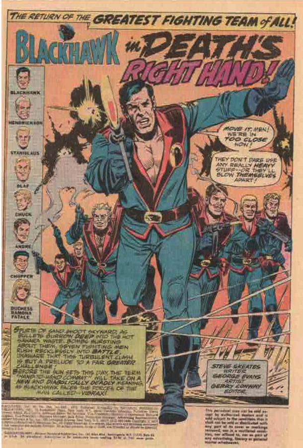
The actual comic is written by Steve Skeates and drawn by one-time EC artist George Evans. This isn't his best work, and kind of swings between terrific and not-so-terrific in terms of quality. No inker is listed, which is probably for the better. In the 1970's a lot of DC's inkers were super heavy handed. While George Evans' art here isn't great it is certainly better than it would be if it were inked by an unsympathetic inker. It’s not hard for me to fault an EC guy for later artwork than isn’t up to the EC standards. By the 1970’s, not much comic art was.
From the indicia, we can see that this is Carmine Infantino era DC, or National Periodical Publications. N.P.P. is the sort of name you could give to your comics company if you were ashamed of publishing comics.
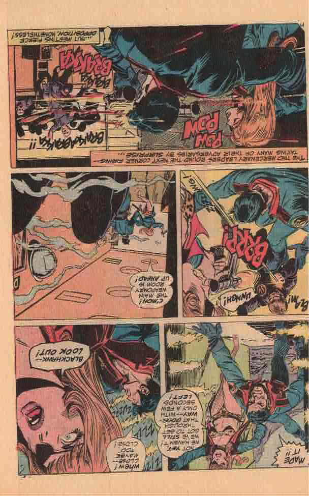
As for the story, we find the Blackhawks finishing a mission for a mysterious "Robinson" who talks to them over a two way TV installed in Blackhawk's jet. However, there's a missing piece to the puzzle - they recovered the plans for a MacGuffin, but not the MacGuffin itself. Mission accomplished, the Blackhawks jet off to their respective hideaways in their respective countries
Except for Hendrickson, who lives on Blackhawk Island. There, he is surprised by a redhead with an eyepatch wearing a bikini. Which I would be, too.

The redhead is Duchess Ramona Fatale, apparently a sometimes friend and sometimes foe of the Blackhawks. She needs their help.
The big bad in this issue is Anton Vibrax, who has a super vibrating hand. I guess name dictates destiny in this case. He can straight up murder people with it. No word as to whether the ladies like this super feat or not. Except Duchess Fatale who is definitely not impressed.

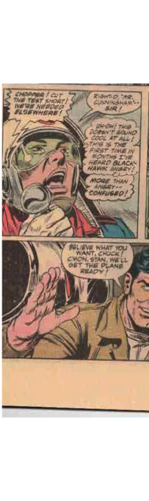
In these issues, the former embarrassing Asian stereotype Chop-Chop is now called Chopper and he is the best pilot in the group whose name is not Blackhawk. He also does not speak in any sort of racist dialect this time around.

Duchess Fatale wins my admiration for her bravery in walking into a firefight wearing nothing but a bikini and a jacket.
Oh, and an eyepatch.
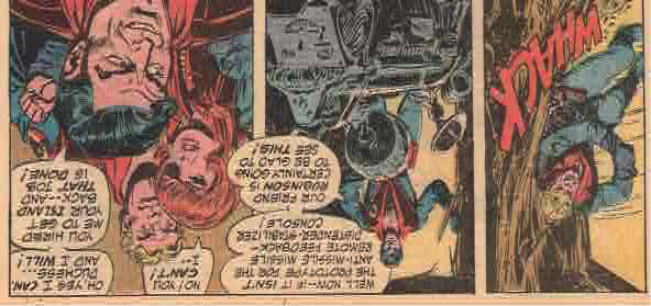
Poor Anton Vibrax gets vibrated to death! Which is kind of ironic?

And it turns out there's MacGuffin relating to the very beginning of the story, with Blackhawk leaving Lady Fatale high and dry.
It's an OK start to a new Blackhawk series. None of the characters save Blackhawk or Lady Fatale get a lot of page time, but it sets up the series for new readers pleasantly enough with the Blackhawks living around the world and coming together in their jets whenever they are needed.
Not sure where, say, Andre parks his jet in Paris but I am sure there is a perfectly reasonable explanation.
As a kid who read the hell out of the Steranko books the Blackhawks should have been manna from heaven for me. Not sure why I skipped it the first time around, except I probably didn;t have twenty seven cents (cover price + sales tax) with me when I needed it.
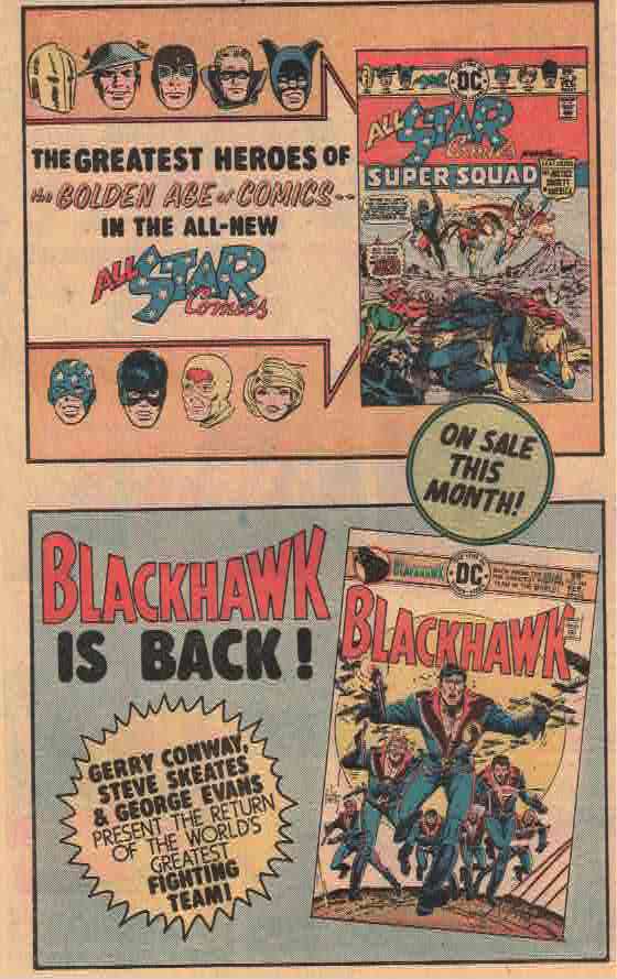
Speaking of manna from heaven for kids who read the hell out of the Steranko books, here is an ad for this comic and for the return of All-Star Comics featuring the Justice Society. I bought the hell out of that comic, and the next issue. Then I don’t think I ever saw one again on the newsstands. The struggle was real in the 1970’s kids.